Let’s start by asking, what does the name BRAC represent to you? Sure, it is the largest NGO in the world that confronts poverty with a holistic approach by providing financial services, health, education and social justice. Statistics will tell you that more than 100,000 BRAC-ites are working ceaselessly to reach 135 million people in Bangladesh and 11 other nations. As a revered and inspired global leader in international development, BRAC has an indubitable presence of its own. Yet mere presence does not necessarily translate to an individual identity. So the question I put forth is what does BRAC, the organisation, with all its breadth and reach, stand for?As international nonprofit organisations expand their scope and reach across borders, they also face the necessity to lay out a singular identity as a foundation. This is where the term ‘brand’ comes in. Researchers point out that in the non-profit sector, a positive brand can enhance its favourable perception to the donors and partners, which in turn helps to serve the stakeholders at all levels. At the same time, it can bring the diverse and evolving aspects of an organisation under the umbrella of a unified purpose and identity. The bigger the organisation, the more the challenges and opportunities branding entails. And few organisations know it better than Bangladesh’s very own BRAC.
Like any healthy organisation’s identity, BRAC’s evolved along with the organisation itself. Just take the name as an example. What started out in 1972 as Bangladesh Rehabilitation Assistance Committee (BRAC), a small initiative dedicated to short-term reconstruction and rehabilitation of war-torn Bangladesh, soon found its necessity and capacity to implement long-term development projects in rural Bangladesh. Hence the organisation was aptly named Bangladesh Rural Advancement Committee in 1973. For the next two decades, BRAC worked steadfastly and exponentially to create better livelihood opportunities for the impoverished, making it an integral part of Bangladesh’s development efforts. In the same decades,massive and unplanned urbanisation meant that poverty was no longer contained in the rural areas. BRAC responded by reaching out to the urban poor, making the ‘rural’ in Bangladesh Rural Advancement Committee defunct. By that time, BRAC had become synonymous with development and trust to its clients, and adapting a new name could challenge its acquired identity and efficiency. In 1992, BRAC decided not to limit itself with abbreviations, and be known as simply BRAC. As BRAC expanded its development efforts globally in 2002, the name BRAC continued to elicit the same trust and reliance internationally as it did nationally.
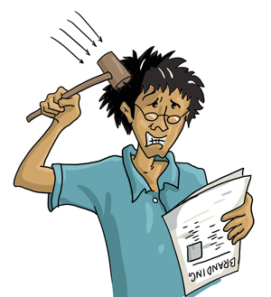
But with a multiplicity of services ranging from financial to educational to legal being provided through different programmes came the risk of clients confusing the identity of the service provider. At the same time, maintaining cohesion by bringing all the programmes under the umbrella of one unified organisation became a concern. Without any central guideline or standard to follow, what already posedas a considerable problem in the national stagecould only exacerbate further at the international level. It was like an identity crisis of global proportions
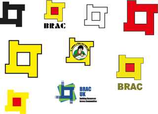
Thus, in 2008 BRAC started its rebranding process. This involved a lot of soul searching and re-evaluation of what BRAC as an organisation had come to be perceived by clients, development partners and by its own people. The initial research findings were shocking; at one point nine versions of the BRAC logo and different designs on basic stationeries were found across the country. It was often found that BRAC’s key messages, image and values existed as misperceptions. But the audience could hardly be blamed. Without concerted efforts to manage or control the brand, it was rather surprising that the organisation had managed to operate with such great efficiency and good will.
Shajedur Rahman Rokon, assistant coordinator of BRAC Communications and a BRAC Values Award winner, was closely involved in the 2008 rebranding process. He describes the ultimate goal of BRAC’s rebranding as creating the idea of a unified ‘One BRAC’. Among the challenges, there was seeking out the single essence of BRAC’s vast array of activities and articulating its own voice in written and visual messages while differentiating it from the other organisations. At its core, the efforts to rebrand were about shaping BRAC’s identity out of its enormous and multidimensional presence.
Rahman described the rebranding process akin to taming a wild horse and the British advertising agency CDT was hired for the task. Almost eleven months of extensive research went into the process, with various stakeholders including clients, donors, government and civil society actors, and development partners were interviewed to find out what BRAC represented to them. The aim was to bridge the gap between the perception of the stakeholders and the image BRAC itself wanted to project. Rahman calls this the creation of a renewed ‘brand promise’, a statement that communicates the one central idea that the BRAC brand represents in the mind of the target audience.
With the issue of brand promise tackled, the next task was to find out BRAC’s own brand colour. Thousands of images of BRAC beneficiaries were taken from all around the world to find out the common colour of everyday lives. Eighteen to 20 colours appeared most prominently and the list was then narrowed down to seven. Finally, magenta was chosen as BRAC’s new brand colour because it represents universal harmony and balance, while embodying the vibrant energy, spirit and passion of BRAC’s clients. Embodying a striking feminine colour also meant paying homage to the majority of BRAC’s clients, women who pulled themselves out of poverty and forward in life with BRAC’s support.
After months of work, BRAC was ready to reveal its reinvented self in 2010. At the centre of BRAC’s new identity was the brand promise: ‘creating opportunity’. Though the concept reverberates in everything BRAC has done since its birth, the simple yet powerful two words embody everything BRAC stands for.The values that give BRAC strength and will enable to reach for higher goals were pinned down as ‘innovation’, ‘integrity’, ‘inclusiveness’ and ‘effectiveness’. The vision that continues to guide it had been articulated as “A world free from all forms of exploitation and discrimination where everyone has the opportunity to realise their potential.”
Shajedur recognises that rebranding BRAC in 2010 was just a new chapter in a continuous process. Yet he believes that now the tools are in place to involve the voices of the stakeholders as the brand consolidates itself as an icon of non-profit branding.
The task of maintaining the brand is already made easy because for the past 42 years,with the combined contribution of individuals and programmes under the dome of one BRAC, the organisation has already established itself as the largest development organisation in the world. It does not matter what language, race, culture, or nation one is from, the millions of BRAC clients and 100,000 BRAC-ites know that they will continue to work to realise a world free of poverty. That is what BRAC stands for.
Asif Imran Khan is a communications officer at BRAC in Dhaka, Bangladesh.